Heatmaps enjoy wide popularity for showing how certain metrics vary spatially over a game environment (the death heatmap might be the prime example here). Heatmaps use a color-gradient to indicate the numerical values. They can be based on a rectangular grid but in relation to game metrics the continuous form seems be preferred. And they rightfully deserve this popularity as they provide an instant overview of the data and how it varies. They are also easy and quick to generate. However, heatmaps are not without drawbacks and this post is about raising awareness about some of them and discussing an alternative, so-called hexbin maps.
- Heatmaps are usually only suitable for showing the spatial distribution of a single metric (e.g., deaths). While heatmaps can be extended to show differences between two variables (e.g., killer vs victim) 1 more than two variables are infeasible.
- The colors and thresholds used in heatmaps can affect the perception of the data2.
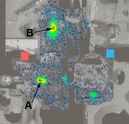
- Heatmaps are great for observing the spatial distribution, but they are not ideal for making comparisons as it is difficult to judge the actual amounts. Compare, for instance, the number of deaths in area B with the ones in area A in the image below. Area B is slightly larger but has less intense red hues, while area A has more intense red tones in a more confined area.
In the following I would like to introduce hexbin maps as a way for visualizing spatial event data. A hexbin map subdivides the environment into regular hexagons to bin the data. The hexagons themselves can then directly be colored according to the data inside the bin or a glyph can be placed within each hexagon to display the data. If a glyph is used the hexagons themselves can also be removed to keep the display simple.
In the below image, I used so-called Wurman Dots4. A Wurman Dot is composed of equally-sized outer circles that indicate the spatial area to which the data belongs to and an inner circle whose size is proportional to the data. The hexagons are thus only shown for illustrative purposes in the image.
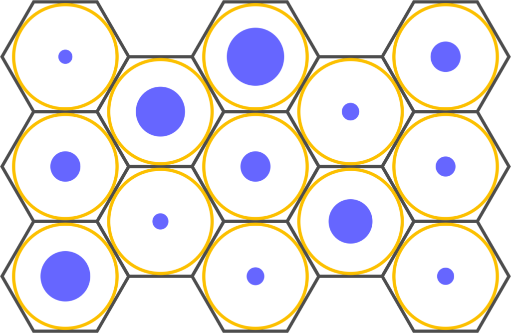
Wurman Dots
- are visually simple (two circles),
- easy to read even when they become small (compared to more complex glyphs such as star glyphs were the shape might not be well discernible any more), and
- can be extended for multivariate data.
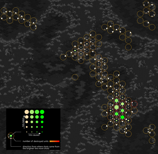
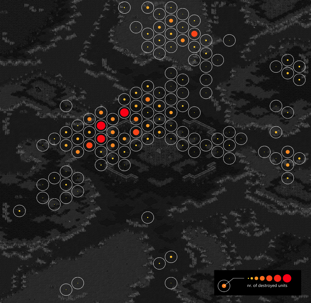
Below such hexbin maps have been applied to data from Starcraft II replays. The first one shows the number of destroyed units within a bin, encoded by the size and the color of the inner circle. In terms of data this is similar to a death heatmap but comparisons are facilitated.
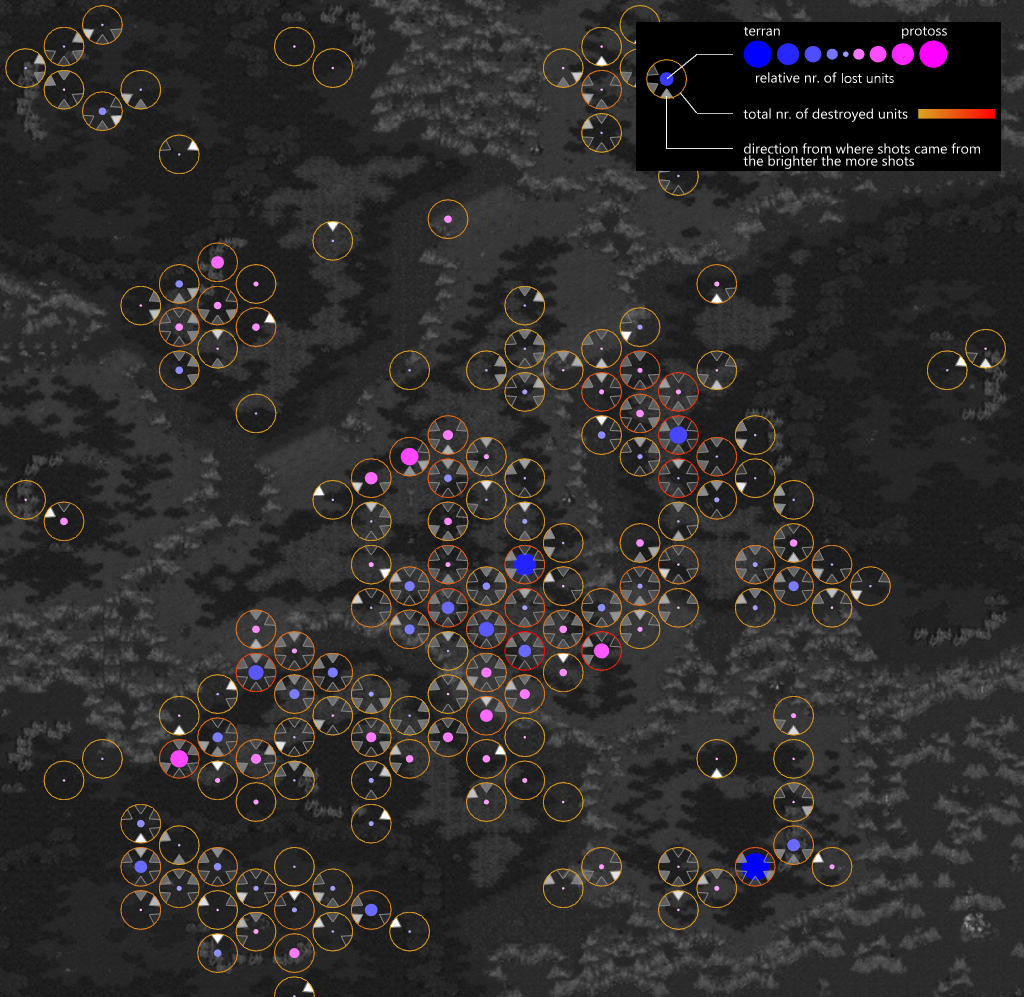
The next map already displays three variables. The relative number of lost units of the two players (radius and color of the inner circle), the total number of destroyed units (temperature gradient of the outer circle), as well as direction indicators to show from where attacks came from.
The final image includes four metrics in total, including total number of destroyed units (color-coded outer circle as above), direction of attacks (as above). However, the circle now relates the number of hits taken (size of inner cirlce) with the hits caused (color of inner circle).
Summary
In short, hexbin maps with glyphs provide quite some flexibility for the encodings to match analysis goals. To summarize hexbin maps have the following benefits:
- The regular grid produced by hexagonal binning facilitates comparisons between areas
- The regular grid also allows to compare data captured at different time points as the subdivision is not affected by the actual distribution of the data.
- Visual glyphs allow to encode and compare multiple metrics within a single map
- Easy and quick to produce making it suitable for processing large-scale datasets
It is, however, important to keep in mind that only a certain number of variables can be reasonable depicted within an area of certain size and that the color-coded areas need to be of sufficient size to ensure that colors can be perceived accurately.
This blog post is based on the following publication: Wallner, G., & Kriglstein, S. (2020, November). Multivariate visualization of game metrics: an evaluation of hexbin maps. In Proceedings of the Annual Symposium on Computer-Human Interaction in Play (pp. 572-584) (bibtex). I have also talked about this briefly at GRUX Online 2021.
1 Drachen, A. (2013). Balance and Flow Maps. Retrieved from https://gameanalytics.com/blog/balance-and-flow-maps/
2 Eghteabs, C., Ritter, B., Parikh, A., & Lischke, L. (2017). Effects of color and threshold on user perception of heat maps. In Proceedings of the 2017 ACM Conference Companion Publication on Designing Interactive Systems (pp. 275-279).
3 Kriglstein, S., Wallner, G., & Pohl, M. (2014). A user study of different gameplay visualizations. In Proceedings of the SIGCHI Conference on Human Factors in Computing Systems (pp. 361-370).4 Drachen, A., El-Nasr, M. S., & Canossa, A. (2013). Game analytics–the basics. In Game Analytics (pp. 13-40). Springer, London.
4 Passonneau, J.R., & Wurman, R. S. (1966). Urban Atlas: 20 American Cities. MIT Press. Cambridge, MA, USA