In a previous blog post I wrote about hexbin maps as an alternative to heatmaps. Hexbin maps can show multiple variables at the same time using a regular subdivision of the map. Such a regular subdivision has several benefits (e.g., ease of comparison) but sometimes a regular subdivision might not be desired and the distribution of multiple variables should reflect hotspots (e.g., areas with a large number of kills) to draw attention to these. In this post I will thus talk about another alternative to heatmaps which visualizes the distribution of the data for each hotspot using a pie-chart, a so-called pie-chart map.
In the following, I will use the example of locations of player deaths such as commonly visualized using heatmaps. However, instead of showing the amount of deaths I will focus on showing the distribution of the weapons used. The data used is from the game Team Fortress 2 from Valve. Each location corresponds to the death of a player. In addition, the type of weapon (short range, long distance, melee) is stored for each death location.
- Creating a pie-chart map first requires detecting such ‘hotspots’, for example, by clustering the locations of the events of interest. For the following visualizations, Quality Threshold (QT) Clustering was used. However, other clustering algorithms such as DBSCAN could be used as well.
- Secondly, a pie chart is then placed at the each cluster’s center, with the area of the circle being proportional to the number of objects in the cluster.
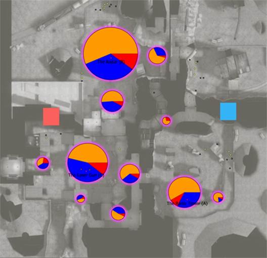
To detour briefly from the main point of this blog post, just a few words about pie charts. Pie charts are viewed ambivalent within the information visualization literature. Cleveland and McGill1 argue that pie charts should be avoided based on their model of elementary perceptual tasks while Spence and Lewandowsky2 have shown that pie charts are more effective compared to bar charts when it comes to conveying proportions. Kosslyn3 argues that pie charts can be useful especially when the goal is to provide approximate relative amounts. As such they appear an appropriate choice for these kinds of maps as long as the number of variables remains relatively small such that the individual sections remain legible.
Based on a conducted evaluation4 of the cluster maps there are recommendable in scenarios where a high level overview of the distribution of the frequency of occurrence of different variables is of interest. They also allow for fast approximate comparisons of relative proportions of different variables. However, exact judgments of proportions across clusters are more difficult to make, as judging absolute values requires taking in to account both the angular sector and the size of the pie-chart.
Summary
Cluster maps can be a useful alternative to heatmaps when the distribution of multiple variables is of interest. This allows judging the relative proportions of different variables. Through employing clustering the pie charts are placed at hotspots, drawing attention to these.
This blog post is based on the following publication: Kriglstein, S., Wallner, G., & Pohl, M. (2014). A user study of different gameplay visualizations. In Proceedings of the SIGCHI Conference on Human Factors in Computing Systems (pp. 361-370) (bibtex)
1 Cleveland, W. S., & McGill, R. (1984). Graphical perception: Theory, experimentation, and application to the development of graphical methods. Journal of the American statistical association, 79(387), 531-554.
2 Spence, I., & Lewandowsky, S. (1991). Displaying proportions and percentages. Applied Cognitive Psychology, 5(1), 61-77.
3 Kosslyn, S. M. (2006). Graph design for the eye and mind. OUP USA.
4 Kriglstein, S., Wallner, G., & Pohl, M. (2014, April). A user study of different gameplay visualizations. In Proceedings of the SIGCHI Conference on Human Factors in Computing Systems (pp. 361-370).